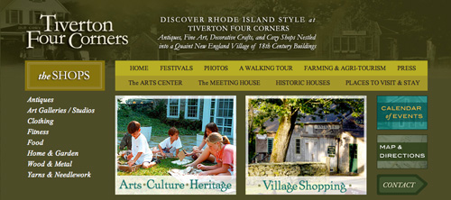
When we received the opportunity to rebrand the historic village of Tiverton Four Corners, one of our most exciting challenges was identifying the appropriate font. We began the hunt by looking at type faces originated in the late 17th and early 18th century, as the village was originally chartered in 1710. Like so many quaint New England villages, Tiverton Four Corners has maintained several historical architectures, though it has also been supplemented with newer construction, many of which were introduced during a revival in the 1980’s.
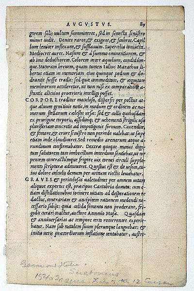
We eventually arrived at Adobe Garamond, a 20th century revival of Claude Garamond’s 16th century original type specimens. Based in part on the hand-writing of King Francis I’s librarian, Garamond offers a lovely, fluid consistency that yields optimum legibility and a richness and warmth that so often accompany types based on hand-writing.
An example of Garamond as it appeared in the 1540 printing of The Twelve Caesars:
To learn more about the history of Tiverton Four Corners, click here.
To learn more about Garamond, click here.
Leave a Reply