The Library of Congress has a rich collection of posters created by the Works Progress Administration which demonstrate our rich history of hand lettered design. These “fonts” still feel contemporary, familiar, elegant.
PISH POSH DESIGN
 …
… A Non-Profit Logo Design
A seasoned Nigerian-American diplomat decided to organize a non-profit, AFRILINK Entrepreneurs Intl., that pairs professional young African entrepreneurs with American business mentors to enrich the small business efforts of stable African communities.
Creating this brand, we started with the logo. The logo needed to speak to multiple markets. First, we are speaking to the established American professionals (potential mentors) who are interested in investing in Africa’s economy.… Read More ›
Designing with Type
Occasionally we get to do a gallery card in which the artwork is not yet available, which means we get to really showcase the fonts in the design. This mash up combines a font classics like American Typewriter with a new heavy-hitter like Bebas. Color plays a big part here as well; we just can’t seem to stop using yellow everywhere this year.… Read More ›
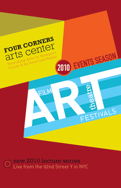
Program Cover
We recently finished this program book cover for the Four Corners Arts Center in which sharp dynamic shapes converge to play on the concept of “four corners.”
 …
…
Posted in design, Uncategorized
Open for Business!
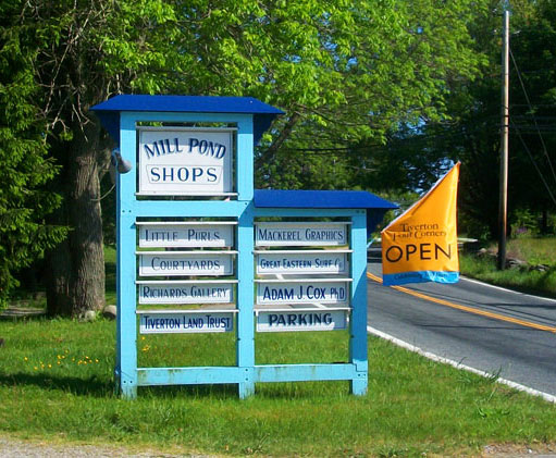
We were delighted to have the opportunity to design the OPEN flags for the businesses of Tiverton Four Corners. Our goal with this collection of sherbet colored flags (pinks, oranges, blues and lime greens) was to highlight the independent businesses on the main thoroughfare of this 300 year old town.… Read More ›
Posted in branding, Uncategorized
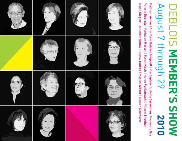
Summer Design
We’ve been working with DeBlois Gallery in Newport, RI for years now, and they’re always up for something fun. This year’s Member’s Show design uses punchy color and contemporary direction. Go see it if you can!
 …
…
Posted in design, Uncategorized
A Website Re-Design
When this San Francisco-based client came to us with an outdated web design, we were eager to help. They had an amazing portfolio of images showing their expert tile and marble designs, and served a high-end clientele, but their web design didn’t communicate their expertise, nor was it as effective as it could be in attracting their target market.

Because the web design was outdated, it had not been built with modern Search Engine Optimization (SEO) practices. … Read More ›
Simple, Elegant Packaging

This 300 year old farm, located in South Dartmouth, MA needed a simple and elegant packaging solution for their organic jellies and jams which sell in local markets and shops. This lovely little hang-tag provides ample space for logo and branding as well as a message about supporting local agricultural on the reverse-side.… Read More ›
Correcting the Past
Many of our clients come to us with old photographs which must be converted to digital files. Photos that have been mishandled, printed on non-archival papers, or are more than ten years old, need to be adjusted in order to rid them of their sepia-type discolorations. This can be quickly and easily accomplished in Photoshop using the “Levels” tool. Beginners can simply click the “Auto Levels” button within the Levels window to yield dramatically effective results.… Read More ›
Posted in photoshop tips, Uncategorized
The Perfect Font
When we received the opportunity to rebrand the historic village of Tiverton Four Corners, one of our most exciting challenges was identifying the appropriate font. We began the hunt by looking at type faces originated in the late 17th and early 18th century, as the village was originally chartered in 1710. Like so many quaint New England villages, Tiverton Four Corners has maintained several historical architectures, though it has also been supplemented with newer construction, many of which were introduced during a revival in the 1980’s.… Read More ›
Posted in branding, typography, Uncategorized Tagged with: branding with typography, garamond, traditional type faces
PISH POSH DESIGN
PO Box 978, Chepachet, RI 02814
401.472.4085
© 2005 - 2022, all rights reserved.
terms & conditions